
User Heatmaps for UniFi networks
Today we released a version of our Captive Portal solution for UniFi networks that includes a number of improvements, including our brand new User Heatmap report.
How is this useful?
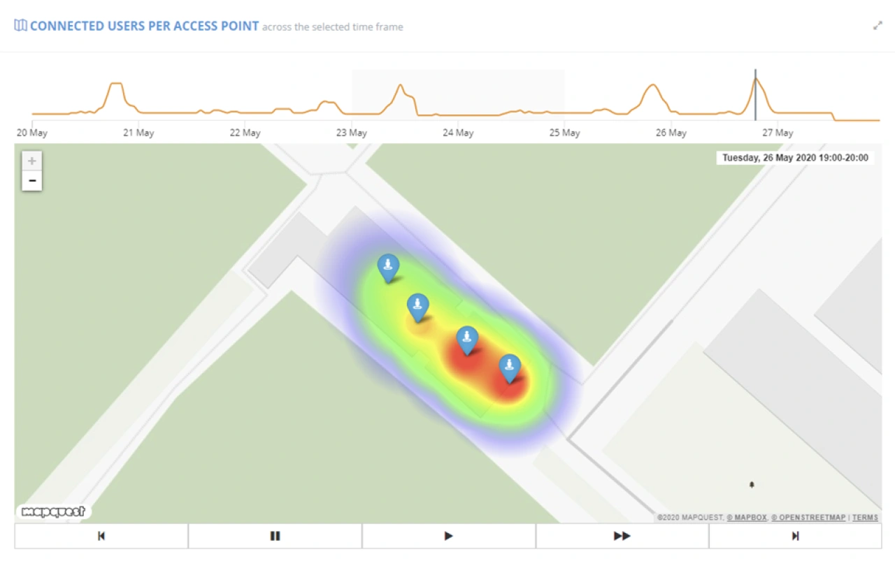
This report allows you to quickly identify the busiest areas across your UniFi site over time. You can navigate through the data either by using easy-to-understand VCR controls or by picking a point in time on the timeline.
This YouTube video shows the new User Heatmap report in action:
Please contact us for more details on our captive portal solutions for UniFi networks here.